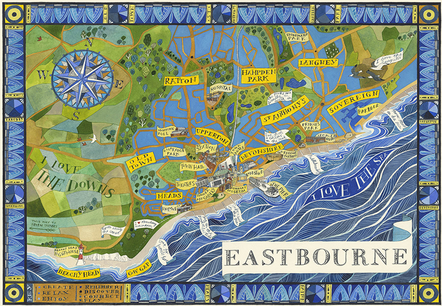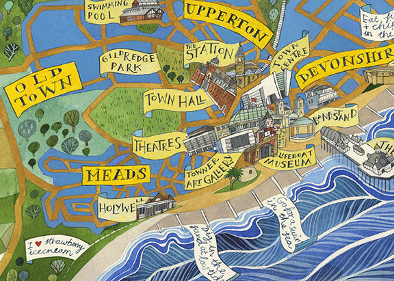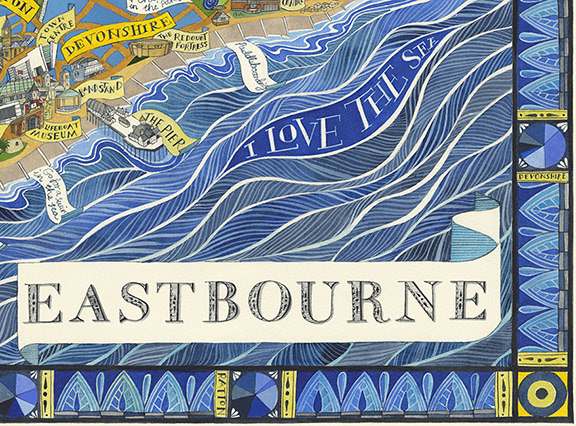
A map of Eastbourne commissioned by the award winning Towner Art Gallery , based in Sussex, UK. Towner is an Arts Council Collection National Partner and holds exhibitions of major national and international work. This map was designed using data the gallery collected from the inhabitants of Eastbourne about what they loved about the town as part of a project, 'I Love Eastbourne'. It shows the nine different town wards, notable public features and direct quotes taken from the research. The general blue and yellow theme of the map reflects the civic colours of Eastbourne. There's also a decorative border which includes a key and pie charts; the public were asked to rate each ward under the following terms - create, relax, enjoy, remember, discover, connect and play - and each chart shows the results for each ward.
The hand-lettering of the title banner was also a key element of the map. As part of the 'I love Eastbourne' project, a font was specially designed by Kate Whiteman, inspired by lettering found on the Figg map, a beautiful 19th century map of the town in the collection. I was asked to include the font somewhere in the design.
The piece is entirely created by hand and the original painting in watercolour, ink and gouache was bought by Towner Art Gallery. Limited edition giclee prints (A3 in size) exclusive to Towner are available to buy from the gallery shop.
Read about the map and the art project here.